September 1, 2013
Gaming, Infographics, REDD Game
 Vivir Bien – living well – is a concept that has been prominent in Bolivian politics over the last few years. It sets out the ideological position of living well in harmony with nature and rejects a mass consumption and fossil fuel based economy.
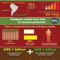
Although Vivir Bien has even been written into the Bolivian constitution with the 2012 Law of the Rights of Mother Earth the country is at a crossroads: what it says and what it does is at an odds. While Bolivia’s leaders propose a harmonious existence, majority of policies are aimed at expanding people’s ability to farm, which leads to the deforestation of around 300,000 hectares of rainforest every single year.
Today, the Institute for Advanced Development Studies (INESAD) came out with an infographic that proposes a two-policy solution that could help Bolivia reconcile its rhetoric with its actions by reducing deforestation while tackling poverty in an equitable way. Read More »
March 6, 2013
Climate Change, Infographics
 Does climate change exist and are humans to blame is a question that still manages to liven up many a dinner conversation. Believers can be short on facts and figures to be quoted in the face of deniers who tend to distrust the science, the politicians, and the activists. Luckily, Mother Jones has a secret weapon: A light-hearted flowchart that can be used as a handy cheat sheet to help put the matter to rest: Read More »
November 26, 2012
Environmental Economics, Infographics, Sustainability
 As part of INESAD’s November Environmental Sustainability month, today’s Monday Graphics series is investigating sustainability in businesses.
This Global Sustainability Scorecard was compiled by McDonalds about its business’s sustainability. Many companies produce graphics like these to make consumers aware of their efforts to protect or contribute to the environment and society (for other big name examples, see the graphics put together by Apple and H&M). While analyzing these, consumers should keep the overall picture in mind: is going green in your office really a mark of sustainability? Are promises that businesses make about one area of their production chain, such as McDonald’s does here about fishing, neglecting their unsustainable habits in other areas? Industrial beef production, for instance, remains a huge problem and causes diseases and deforestation, and McDonald’s happens to be one of its main proponents. Are the businesses really helping the environment, or are they only making their impact ‘less bad’? Read our recently published article on the topic ‘How ‘sustainable’ is sustainable development in the corporate world?’ Read More »
November 5, 2012
Climate Change, Environmental Economics, Fun, Infographics
 Over the next four weeks, to coincide with INESAD’s Environmental Sustainability Month, Development Roast will release fascinating and informative infographic every Monday. To kick off the month, we bring you those depicting one of the most pressing environmental issues to date, global warming.
Read More »
October 1, 2012
Cartoon Economics, Fun, Infographics, Macroeconomics
 This month, for our Monday graphics series, Development Roast has teamed up with FSG Books and University of Washington Professor of Economics, the world’s first and only stand-up economist, Yoram Bauman to bring you a sneak peek into the second volume of his book The Cartoon Introduction to Economics. Learning should be fun, so for five weeks during October, to coincide with INESAD’s Fun Economics Month, Development Roast will share one of the fascinating and fun cartoons from Volume Two: Macroeconomics. Today’s cartoon asks: What’s more important, short- or long-term growth and stability? Read More »
September 24, 2012
Infographics, Peace
 It is no secret that every nation in the world struggles with peace and stability in some way, shape or form. The Global Peace Index (GPI) attempts to capture this process by collecting data and information and collating it into 23 indicators that give countries a final score between one and five. You can view a map of the 2012 GPI around the globe here.
Hispanically Speaking News has gone one step further and organized the 2012 GPI measures for Latin American countries into an easy to understand infographic: Read More »
September 17, 2012
Infographics
 Many people in Latin America live in poor quality housing or in no housing at all. According to an Inter-American Development Bank (IADB) report entitled Room for Development: Housing Markets in Latin America and the Caribbean, over two thirds of households in Nicaragua, Bolivia, Peru and Guatemala lack adequate housing. The IADB has developed a very informative infographic to illustrate these and other country differences in the region: Read More »
September 10, 2012
Environmental Economics, Infographics
 There is a lot of talk about carbon accounting, carbon footprints and future sustainability, but these things are hard to imagine on a day-to-day level. Fortunately, many organizations are trying to make this topic easier to digest by coming up with ingenious inforgraphics to illustrate the point. Two in particular are helping people see their own country’s carbon footprint in five different ways. Read More »
September 3, 2012
Environmental Economics, Infographics
 Many economic mechanisms have been put forward to try to better manage natural resources. The UN Reducing Emissions from Deforestation and Forest Degradation (UN-REDD), for example, aims to put a financial value on the carbon stored in rainforests and incentivise developing countries to maintain them. Other systems in place give tax credits and other incentives to businesses for becoming more sustainable, but how ready are they to count their own carbon emissions? This is the question that Epicor asked in a survey of almost 1,000 companies from across the world earlier this year. The result? An inforgraphic that reveals fascinating facts like 58 percent of businesses had never even heard of carbon accounting: Read More »
May 17, 2012
Agriculture, Conservation, Diet, Ethics, Food, Infographics, Natural Resources, Solutions, Water

 Meat production is thirsty business. Do you know much water do you eat? INESAD’s latest inforgraphic provides some real food for thought. Did you know, for example that a beef burger takes 2,400 litres of water to produce, compared to 170 litres for a vegetarian burger.
Find out more at www.unwater.org and www.waterfootprint.org.
Read More »
 Development Roast Giving international development a proper roasting

