It’s Carnaval week/month in Bolivia – the time of year when most beer is drunk. Beer prices have just gone up again, now reaching an outrageous Bs. 9, or more, for a small can of standard beer in supermarkets. This corresponds to USD 3.64 for 1 liter of beer, way more than it costs in rich countries such as Denmark.
If we take into account the low level of wages in Bolivia and the high prices of beer, Bolivia becomes one of the most expensive places in the world for beer lovers. On average, Bolivians have to work about 145 minutes to afford 1 liter of beer (1), whereas in the United States on average they only have to work for 10 minutes (see figure 1).
Figure 1: Minutes of work required to purchase 1 liter of beer in a supermarket
Source: Author’s elaboration based on data from The Economist + Bolivian data (http://www.economist.com/blogs/graphicdetail/2012/09/daily-chart-13?zid=319&ah=17af09b0281b01505c226b1e574f5cc1)
November 13, 2013Climate Change, Infographics, PolicyComments Off on “Climate Finance for the Developing World: What is needed and how to make it inclusive?”
By: Lykke E. Andersen, 13 November 2013
Climate change negotiations have entered peak season again with the COP 19 just starting in Warsaw. What is it that they say: 19th time is a charm?
This year, like previous years, key questions related to climate finance have been discussed extensively in many different settings with many different experts and stakeholders all year. Last month’s PEGNet conference in Copenhagen was one such venue. As the session chair of the above titled roundtable, I fully realize the depressing repetitiveness of yet another climate finance discussion, but I still think the main points are important and original enough to share.
Vivir Bien – living well – is a concept that has been prominent in Bolivian politics over the last few years. It sets out the ideological position of living well in harmony with nature and rejects a mass consumption and fossil fuel based economy.
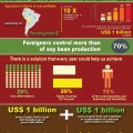
Although Vivir Bien has even been written into the Bolivian constitution with the 2012 Law of the Rights of Mother Earth the country is at a crossroads: what it says and what it does is at an odds. While Bolivia’s leaders propose a harmonious existence, majority of policies are aimed at expanding people’s ability to farm, which leads to the deforestation of around 300,000 hectares of rainforest every single year.
Today, the Institute for Advanced Development Studies (INESAD) came out with an infographic that proposes a two-policy solution that could help Bolivia reconcile its rhetoric with its actions by reducing deforestation while tackling poverty in an equitable way. Read More »
When asked about their experiences over the past 12 months, one in five Bolivian women claimed to have been victims of physical abuse, with 53.3 percent of women reporting physical violence by a partner.
Intimate partner violence in Bolivia is 35 percent larger than the next highest abuse rate of 38.6 percent for both Colombia and Peru. At 17 percent, Dominican Republic appear to have the lowest, albeit still unacceptably high, level of partner violence against women. Read More »
The concept of a “flipped classroom” emerged in the late 2000s as an alternative (or the beginning of one) to the classical system of teaching where the teacher introduces the content in class and the students practice it at home. Instead, in the flipped classroom, students learn the content at home, and do the “homework” in class. The concept’s creators, two American high school teachers Jonathan Bergmann and Aaron Sams, first recorded lectures for students who had missed classes. Soon, however, the lectures became so popular that they decided to substitute all their classroom lectures with online ones, and use classroom time to engage with students individually. This flipped classroom allowed for students to learn at their own pace, enabling them to skip the online videos that they feel like they master, and repeat those on which they are stuck. The model proved a big success: many of the students’ performances improved, better preparing them for jobs that (should) await them, and they seemed to be having more fun than before.
Does climate change exist and are humans to blame is a question that still manages to liven up many a dinner conversation. Believers can be short on facts and figures to be quoted in the face of deniers who tend to distrust the science, the politicians, and the activists. Luckily, Mother Jones has a secret weapon: A light-hearted flowchart that can be used as a handy cheat sheet to help put the matter to rest: Read More »
An answer to the question What exactly is wrong with industrial agriculture? deserves a whole month’s of posts discovering the issue from both sides. However, sometimes a good graphic presentation, in the old phrase of “a picture is worth a thousand words”, can neatly sum up the arguments involved. Although clearly stating the case against industrial agriculture, the following infographic by The Christensen Fund, first posted by the Nourishing the Planet project, does an excellent job at illustrating why it is that the more natural agroecological methods of crop production are more environmentally and socially sound.
Chatham House, a London based international affairs think tank and home of the Royal Institute of International Affairs, has developed Resource Futures, an excellent and evidence-loaded infographic that illustrates the new political economy of global resources.
Visitors to the interactive site are invited to visually explore resource use around the world and are enlightened to the mapping of current trends. Starting with trends in consumption, data is graphed onto a world map and a navigation tool at the bottom of the screen allows one to switch seamlessly between statistics for different crops, fish and meat, timber, fossil fuels and metals: Read More »
All this month Development Roast has looked at different psychological issues involved in poverty. Today we ask: Does a population’s mentality affect a nation’s development? More specifically, is it possible that when many inhabitants of a country are children of multiple generations of poverty that they can suffer from what could be described as “learned helplessness”, which, as the name suggests, is a feeling of utter disempowerment and uselessness (see graphic).
This idea was first outlined by American educator and author Ruby Payne in her 2005 book “A framework for understanding poverty”. From her studies of the Urban American class system she concludes that one aspect of generational poverty is a learned helplessness that is passed down from parents to children. This mental attitude means that, unlike the middle and upper classes, many poor people do not foresee a future that is free of poverty and therefore do not have the motivation to even try to escape it. Read More »
It has been long established that national measures of wealth, such as the Gross Domestic Product (GDP), do not tell the whole story of people’s lives. The search for a more inclusive representation of what is important has been on for a few decades. The Human Development Index (HDI), for example, was first published in 1990 by the United Nations Development Programme (UNDP) as a direct response to Amartya Sen’s capability approach. This Nobel Prize winning economist’s groundbreaking insights argued that governments should not only focus on increasing citizens’ monetary wealth, but on ensuring that they are able and capable of achieving their dreams, goals and full potential in the society they live in. The HDI, which was co-created by Sen himself, is a composite measure that takes into account the GDP, life expectancy and education levels in each country. Although it is still by no means perfect, since its conception, critiques of the HDI, namely measurement errors and the important things it still does not capture, have been incrementally addressed and incorporated into later versions. For example, the 2010 HDI was the first to factor in inequalities in the three mesaures between the world’s nations, creating a separate Inequality-adjusted Human Development Index (IHDI). You can download the full 2011 country rankings here.
 Development Roast Giving international development a proper roasting


 Vivir Bien – living well – is a concept that has been prominent in Bolivian politics over the last few years. It sets out

 Does climate change exist and are humans to blame is a question that still manages to liven up many a dinner conversation. Believers can be short on facts and figures to be quoted in the face of deniers who tend to distrust the science, the politicians, and the activists. Luckily,
  An answer to the question What exactly is wrong with industrial agriculture? deserves a whole month’s of posts discovering the issue from both sides. However, sometimes a good graphic presentation, in the old phrase of “a picture is worth a thousand words”, can neatly sum up the arguments involved. Although clearly stating the case against industrial agriculture, the following infographic by
  Chatham House
 All this month Development Roast has looked at different psychological issues involved in poverty. Today we ask: Does a population’s mentality affect a nation’s development? More specifically, is it possible that when many inhabitants of a country are children of multiple generations of poverty that they can suffer from what could be described as “learned helplessness”, which, as the name suggests, is a feeling of utter disempowerment and uselessness (see graphic).
  It has been long established that national measures of wealth, such as the Gross Domestic Product (GDP), do not tell the whole story of people’s lives. The search for a more inclusive representation of what is important has been on for a few decades. The